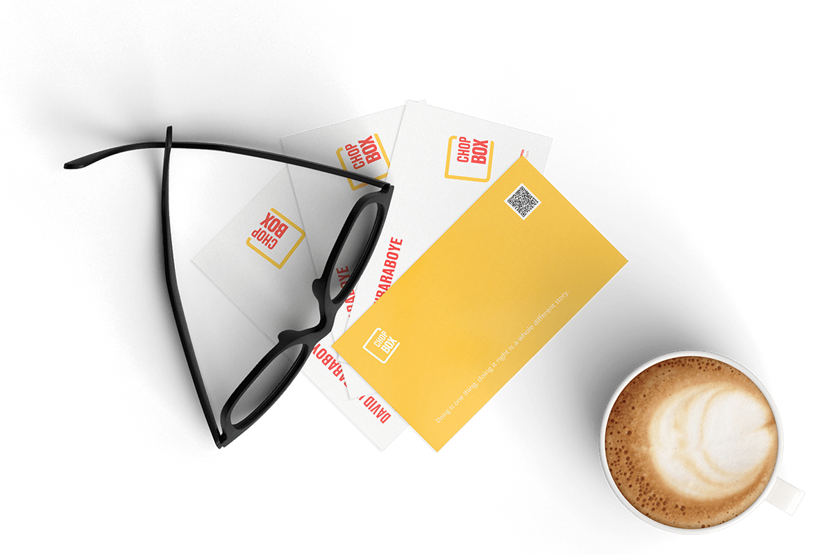


ChopBox is a Port Harcourt based brand that makes and sells classic bite-size Nigerian snacks, popularly known and loved as "small chops". Growing from a need to set a standard in the food business, the goal of ChopBox is to make small chops readily available to people in Port Harcourt without substituting quality and great taste. They aim to achieve this by sufficiently attending to on-demand needs during lunch breaks, get-togethers and parties at fairly affordable prices .


The task for ChopBox was to create a visual identity system for an ambitious new brand that is easily recognizable, expresses the brand’s value proposition, sends a strong signal about the brand they strive to become and allows ChopBox to succinctly stand out from other vendors in the same market space.

Being the first and most recognized part of the identity, the logo has to be clear, concise and easy to recognize. Before ideation, brand research of competitors (direct and indirect) was done to discover how best to present ChopBox to the people of Port Harcourt. We looked at how notable small snack brands positioned themselves visually and in brand language as well. The results gotten were key drivers in creating the ChopBox identity.
From research finding, we deftly crafted what the ideal personality of ChopBox should be. It includes aspects like:
• Lighthearted,
• welcoming,
• dependable,
• unpretentious &
• playful.
This information was the backbone in creating the visual identity as well as certain aspects of the brand's language.

When craftting the ChopBox logo, three key ideologies were in mind that drove the creation of the ChopBox logo: simple, unique & memorable. The final result is a simplification of ChopBox's ideals.
The Chop Platter (the yellow band surrounding the logotype) was inspired by aluminum foil packs used to package the myriad offerings ChopBox has available for customers to purchase. It was skewed at an angle to evoke the look of a head thrown back and chopped to mimic the look of an open mouth. The logotype was then used in filling that "mouth" space, thus visually representing ChopBox's purpose to completely satisfy its customers' demands.
We used a block typeface to give the identity a strong yet appealing finish, so it is unmistakable, easily identifiable anywhere and in any form of media as well as allowing it to remain fresh enough to appeal to the target market.
In terms of color, we chose colors to appeal that have worked overtime for mainstream food brands in a bid to evoke similar emotions these colors have been known (and proven) to do.
For visual language, we considered going with a casual and informal approach considering the geographical location of the brand. Located in the most populous city in the Niger Delta region, most people enjoy conversing in Pidgin English, Nigeria's own vernacular language. The language is beautiful and knows no barriers as it is spoken fluently by both educated and uneducated. To stand out, we believed that adding a touch of locality to the brand tone with Pidgin English would be a big differentiator from other brands and should be used in brand communications, albeit sparingly.


Asides the brand's logo, other assets were created to give the brand a cohesive visual identity to be used across digital and physical touch-points to ensure the goal of standing out is achieved through brand consistency.
These assets include a a brand pattern, a brand color palette aptly named after common things/aspects relating to the brand's daily activities, as well as select typefaces that fit the brand's typology to be used on all brand collateral.

The Chop Box Link, created from the Chop Platter icon.

Deepfry yellow & Fireside red are the brand's default colors. It is the primary choice when implementing the logo on light surfaces and will be used on collateral regarding brand communications such as envelopes, letterheads and business cards.
In situations where neither Deepfry yellow nor Fireside red can be used, Grill black and Wrap white can come into play. This can be used on advertising collateral such as posters, billboards, and flyers.


Thank you for viewing.
Fun fact: ALL animations were done with PowerPoint. 🙃


